


Dynamic Style Guide
Our Dynamic Style Guide is an essential tool for Core Framework users, providing a fully responsive and adaptable design system. With real-time updating capabilities, it seamlessly adjusts to your chosen colors, tints, and shades, ensuring brand consistency across all elements. Included with the guide is a foundational website mockup, allowing you and your clients to visualize your brand before initiating any project.
Additionally, we’ve integrated a dynamic Accessibility Matrix, enabling you to assess the readability and contrast of color combinations—ensuring your designs meet accessibility standards from the outset. This is especially useful for clients to see how their brand colors perform across various elements.
🚀 How to Use:
Install Core Framework
Add the design set key
Adjust global options and add brand colors
Import the sections!
✅ Best Features:
Fully dynamic Accessibility Matrix!
Updates in real time with Dark Theme toggle!
Website Mockup for instant visualization.
👇 Ideal For:
Personal Websites
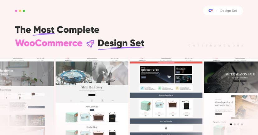
Agency Websites
Users working closely with customers regarding Brand Identity.
Report this product
This product requires our Bricks Builder Integration for the seamless integration. Purchasing it together with any kit will save you 20%!
FreeNo payment required
Get it for free- Freebie
- Dynamic Style Guide
- Color accessibility table
- Light / Dark mode
 Core Framework